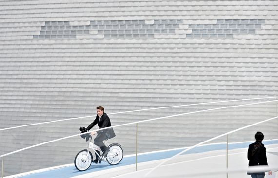
Bjarke on the loop


A great shot of Bjarke Ingels riding a bicycle on the roof of the Danish Pavilion at the Shanghai World Expo 2010. Full-size image and more at The Big Picture.

EDIT: The first pictures from BIG's Danish Pavilion, a delightful gallery not to be missed at GreenWabii (wonderful blog btw). O meu agradecimento ao Henrique Almeida pela informação via email.

Would you kindly, Mr. Ebert?


Roger Ebert says video games can never be art. Big Daddy isn’t happy.

Roger Ebert, one of America’s most esteemed film critics, triggered a monumental discussion on the gaming community with his recent journal entry: Video games can never be art.
The debate on whether video games are worthy of aspiring to become an art form isn’t new. Ebert’s take on the subject, although somewhat narrow considering the references provided and his own conceptions of what makes an art form, received well over 3000 comments online in just a few days and originated very interesting arguments on the web regarding both sides of the discussion. No matter how you look at it, as Adam Sessler said recently, video games present a very interesting problem to the question of what makes an object of art. Games are open experiences, unlike cinema, allowing the player to become both a participant and a director of the overall experience through variable degrees of interactivity and freedom. Still, every choice a player makes within the boundaries of a video game is determined by the vision and parameters defined by its creators. Interactivity is an integral part of the structure of a videogame, just as much as its conceptual design, its music, its storyline.


Perhaps the problem with this debate begins with the notion of “something” as an art form. For example: cinema (or painting, or sculpture) is an art form. Of course we know what this means in a normative sense. But the fact remains that these are abstract concepts, since we all comprehend that only a fraction of the films produced in the world are worthy to be defined as objects of art. In that regard, we should consider that what these are (movies, paintings, etc) are vehicles for human expression that carry the potential to transcend their medium and become very powerful transforming experiences. Michelangelo’s frescoes on the ceiling of the Sistine Chapel are not art because they are paintings on the ceiling of a church but because they transcend into the world of ideas, they express the frailties of human nature and our relation with the divine. La Gioconda isn’t art because it’s a painting but because it reveals the complexities of human expression and female beauty. We hardly know how to explain it but we recognize it, because once we see it we will never forget it. True art transforms who we are, our personal references, the foundations upon which we build the future of our experience as human beings. And in becoming these experiences, they become art.


Can video games be art, then? The problem with the question begins with that which we define as video games. Tetris is a game. Heavy Rain is a game. But are they even the same thing? The diversity of what falls under the category of gaming comprises a much wider assortment of creations than that which we would define as films. Tarkovski’s Stalker and Rambo 3 are both films, constructions built on image and sound, structure and sequence. And yet, concerning their nature as aesthetic objects or their potential value as art, we can hardly consider them products of the same discipline.
Interactive entertainment has witnessed an outstanding evolution in recent years regarding internal complexity, narrative quality, artistic design, every element that goes into the making of a video game. Maybe we have to recognize the fact that The Godfather of video games has not been made yet; a construction so perfect that would present itself as a moving experience capable of transcending into an object of art. And still, in many contemporary games, we find glimpses of what this incredible new medium is capable of.


The geek in me could bring forth many examples. I’ll state just one. Somewhere in Assassin’s Creed 2 you are transported to the streets of late 1400’s Venice during the carnival, as the night sets in, and you are free to wander through performing artists, vendors, people walking and talking. And there you are, not even rushing for the next “mission”, just strolling the narrow alleyways, appreciating the sights and sounds of it all, surrounded by outstanding architecture, wondering about that time in history and how it might have been something similar to this, realizing, if just for a moment, that a video game can truly transcend into a fabulous experience. So yes, maybe games are still a bit sketchy, too digitally clean, too mechanical in structure, but already there is so much amazement to be found in them.


And why should gamers care, anyway? Why should they require validation on the possibility of video games becoming an art form? Why can’t gamers just stay happy playing their games within their little nerd zone, leaving “serious arts” alone for the enjoyment of the highbrow. Maybe because we would like to say we’ve been appreciating art into the wee small hours of the morning instead of confessing we’ve been playing GTA all night long. Or maybe it’s because we know better and have our eyes wide open to this new, entertaining, educational, emotional medium that delivers such extraordinary atmospheres, landscapes, storylines and possibilities. And we’re wonderful, incurable geeks, just as well.


The title of this post is a reference to the game Bioshock. Concept art from Bioshock 2, Assassin’s Creed 2 and Mass Effect 2.
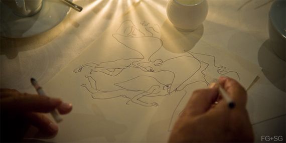
Sketches at dinner


Image credits Fernando Guerra.

As new forms of processing architectural design take over the way we approach, think and communicate architecture, the task of sketching seems to take a step back from our daily routines. And yet hand drawing has always been one of our most treasured tools, guiding us in the process of constructing meaning from the bits and pieces of life, building a travel log or capturing the details of the city and its inhabitants.
The collection of drawings by Álvaro Siza, now published under the title Sketches at dinner, presents an opportunity to discover the intimate dimension of his personal expression. In Siza’s own words, drawing is project, desire, liberation, chronicle and communication, doubt and discovery, reflection and creation, contained gesture and utopia.


The collection «Sketches at Dinner» is also available for purchase as book / exhibition catalog.

The geek’s guide to green building

Catherine Mohr, robotics engineer and green geek, talks about her experience of building a house. Her short presentation is quite a good reminder that, when it comes to energy efficiency, sometimes the elephant in the living room isn’t quite what you expect it to be. The techniques applied in the construction process are just as important as the materials used, and even then the finishes are just a tiny fraction of the energy footprint equation. Something we should all take into consideration when building or designing a house, discarding green propaganda with actual facts and quantifiable numbers.
Watch Catherine Mohr’s presentation on TED and make sure not to miss the interesting debate on the comments section.

Eyjafjallajökull time-lapse video


A time-lapse video of the Eyjafjallajökull condensing 30 minutes of volcanic activity down into 18 seconds.

The brutal landscape


Image credits: Örvar Atli Þorgeirsson, via Iceland Eyes.

The shocking images of the Eyjafjallajokull reveal the volcano’s unyielding confrontation with the measure of human scale. Consequences range from local impacts, as the settling ash becomes a toxic threat to Iceland’s agricultural region’s livestock, to global economic effects that spread out relentlessly across the globe.
And yet the Eyjafjallajokull proceeds in disregard for our fears and trepidations, releasing its mighty roar through the brutal landscape. There is startling poetry to be found on this blend of fire and ice, light and shadow, as caught by the lens of Örvar Atli Þorgeirsson.

Everything is changing. The heart of our island is pulsing, throbs exposed for all to see, releasing a nature we've not witnessed for aeons. And we're to let our own hearts beat in time, push past the fear, find the Love we've forgotten or neglected, welcome the spirits, and dance. This is Paradise, and a most beautiful moment to be alive. (Via Iceland Eyes).

Where’s the Portuguese Pavilion?


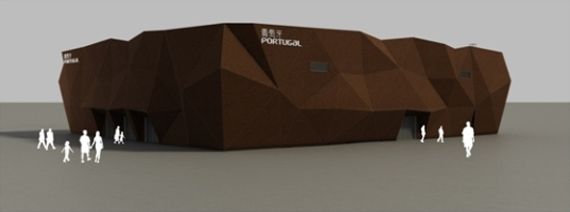
One thing we can say about the Portuguese pavilion: it’s really corky.

The Shanghai World Expo 2010 will open its doors in just a couple of weeks. Dozens of international pavilions are rushing through the final stages of construction and, as expected, news and images are being revealed all over the web – just take a look at ArchDaily to get the idea. And still, 15 days to go, this is the only image we can find regarding the design of the Portuguese pavilion.
The official website of the Portuguese participation does offer a glimpse into the ideas and themes that served as inspiration for its design – a public space of urban expression, referenced in the most iconic plaza of the city of Lisbon, the Praça do Comércio. When it comes to the architecture of the pavilion, however, the information is lacklustre to say the least. Besides the cork covered façade, reflecting the mandatory sustainable significance that fits well with the exhibition’s guiding principles, there’s not much to seduce the unsuspecting visitor. The unadorned programmatic description doesn’t help either. This is the kind of event that would justify greater vision and flamboyance, merging architecture with a deeper sense of storytelling. Considering the long historical relationship between Portugal and China, and the many ways in which online platforms can be used to promote such event, there’s just not enough to catch the fancy of potential visitors into a desirably memorable experience. And when that happens, people tend to move on.

UPDATE: There's an alternate image available, apparently. It's the same as the first one, it just has a little more bling.

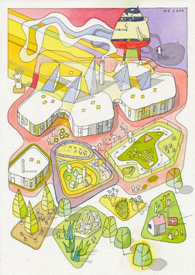
CEBRA_toons: telling the story without words


CEBRA is a Danish architectural firm founded in 2001 by the architects Mikkel Frost, Carsten Primdahl and Kolja Nielsen. Some of their projects were recently featured on ArchDaily, the latest of which is the winning proposal for a Design Kindergarten, a daycare center structured around a series of building modules dedicated to different artistic activities. The project is presented through a sequence of concept drawings that break down the design process and effectively communicate the guidelines and priorities that served as reference for the final architectural solution.
Besides having a rich and interesting website, CEBRA also shares a gallery of watercolor drawings on their sub-blog CEBRA_toons. It’s a gallery of cartoonish renders that sum up a selection of projects they’ve made so far, each presented in a single A4 sheet. What’s interesting about these drawings is not only their artistic quality but also the ability to combine all the ideas that sustained their architectural vision in a single image. I leave you with some examples but make sure to visit CEBRA_toons to see the entire collection. Click to expand. [+/-]


More at CEBRA_toons.

Not even the truth will set them free

Michael Specter’s presentation on TED – The Danger of Science Denial – is a fascinating reflection on the many ways in which our society is becoming unscientific. It’s a good introduction to some of the ideas explored in his book Denialism, examining the many ways in which people are rejecting knowledge supported by scientific data to embrace what often seem to be comfortable fictions. As an example, Michael brings forth the debate between organic versus genetically modified food, and how it has become a purely rhetorical debate of ideological outlines having nothing to do with science. And this I find really interesting because I believe has correlation with what’s happening with sustainability regarding many fields of knowledge, architecture included, and how it’s also establishing itself as an ideology, propped up by design trends the likes of green rhetoric, and not as the subject of scientific investigation based on quantifiable data.
Another interesting notion brought up on his presentation is our negative notion of progress which reflects our common disbelief for institutions and dread for the corporate world. This may be justifiable in many ways, but has also triggered our society into becoming one of the most conservative in human history. Why is it that we have such a deep ambivalence towards progress, towards change? Why is it that we often express such a strong disbelief for ourselves? Michael Specter brings forth some powerful questions, remembering us that we’re entitled to our beliefs, to our fears, but we’re not entitled to our own facts. And if we’re not searching for knowledge, based on truthful observation, on causality and correlation, then, as he eloquently puts it, not even the truth will set us free.

Traffic visualization in Lisbon

Pedro Miguel Cruz has published a series of video animations that reveal the traffic intensity in the city of Lisbon during a 24 hour period. It’s an example of information design applied to the field of urbanism providing a curious observation of the city as it comes to life, the streets pulsing as the arteries of a living organism as the traffic densities become more intense during the day. It would be interesting to further manipulate this data and associate these flows with different areas of the city considering factors like urban district period of origin or street typologies, exploring densities and occupation types within each sector. This would obviously involve the gathering of huge amounts of data and an army the size of Google to process, but it would also bring enormous potential as an auxiliary tool for urban planning.
I’ll keep paying attention to the work of this information designer and keep you posted as new things show up. Also, if you haven’t seen it before, make sure to watch his previous graphic experimentation titled Visualizing Empires Decline, which is really remarkable.
Via People and Place + The Pop-Up City.

How hard it is to know something

I was listening to this old interview with Richard Feynman and it occurred to me how architects also present themselves as experts on something that is ultimately a subjective form of practice.
Architecture is not a pseudoscience, but it is not a science either. Architectural design relies on a subjective process of discovery that seeks to establish a structured construction of ideas; a sense of logic. We are required to provide solutions that are demonstratable, in one way or another, and so it is that we often find ourselves facing an ambiguous paradox. Because our whims are not recognized as a respectable foundation for a design we perform to our best ability as credible professionals, as we try to sustain some kind of scientific argumentation upon which we can assemble our ideas.
But how is it that we can establish logic from subjectivity. Yes, we collect data, we experiment with theoretical hypothesis, we ponder over the consequences, but in the end there are no deterministic laws that induce a specific solution or design. What drives us from A to B is a very subjective process we’ve come to know as creativity.
Maybe we can understand this better if we take note of what António Damásio wrote on his essay Descartes’ Error: Emotion, Reason, and the Human Brain. He demonstrates that the absence of emotion in fact compromises the decision process, the human capacity of being rational. Maybe we can say, in very simple terms, that we need our subjectivity to be objective. It is through subjectivity that we are able to establish priorities and make sense of what is relevant and important.
It’s interesting how contemporary architecture has developed processes, like programmatic strategizing and creative diagramming, in the attempt to nurture a more solid foundation for its practice. To become more scientific, perhaps? But the truth is we rely on certain ideas we accept as valid by default. We hardly question what we already know, but how is it that we know what we know? Take sustainability, for example, and how it has so often become an aesthetic discourse. Green roofs, rotatable buildings, vertical farms; concepts seldom questioned on quantifiable terms. In urbanism these flaws are even more dramatic. We understand that lower densities will determine greater energy costs, and higher densities will result in more complex social realities. Some people say that taller housing buildings can be directly associated with certain forms of criminal behavior, resulting in higher crime rates. Maybe it’s true, maybe it isn’t. But again, we’ve hardly established any demonstratable laws to quantify these realities, and still we are expected to develop accurate solutions that take these problems into consideration.
The truth is that we elaborate upon a painstaking process of trial and error. And we have large margins for error. Paraphrasing Feynman’s own words: I don’t know the world very well. That, my friends, is not humility. Just a scientific mind at work.

Skatepark madness


UK based Maverick Industries presents some radical concrete skateparks on their website. Check their videoportfolio on Vimeo.

Não negue à partida uma ciência que desconhece


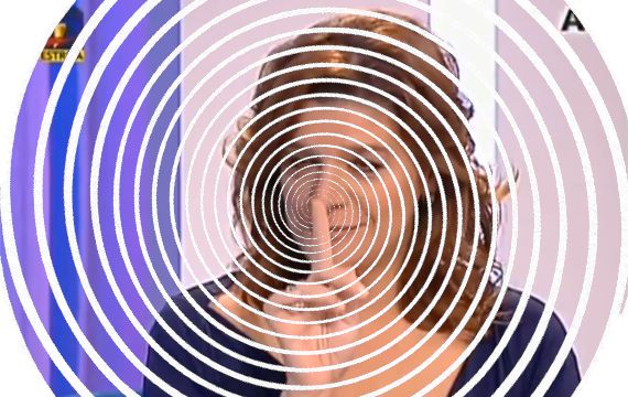
Look into my eyes, look into my eyes, the eyes, the eyes, not around the eyes, look into my eyes…

Beneficiando dos conhecimentos que adquiriu na licenciatura em Línguas e Literaturas Modernas, a Drª. Júlia Pinheiro brinda-nos com outro excelente momento da melhor ficção nacional, porventura até internacional, com chancela da TVI. Num grande show televisivo intitulado Depois da Vida podemos testemunhar os perturbantes dotes mediúnicos da famosa britânica Anne Germain.
Só um céptico superficial poderá negar os poderes desta especialista nas artes paranormais da escola do grande hipnotista Kenny Craig. A sua capacidade de penetrar na vulnerabilidade emocional das vítimas… perdão, dos convidados do programa através de um chorrilho de banalidades e lugares comuns inespecíficos é nada menos que notável. Com efeito, ninguém poderá cientificamente negar que por detrás desta senhora não esteja a pairar o fantasma de seu pai, depositando a mão no ombro de sua filha enquanto mostra fotografias invisíveis à tele-vidente. À eficácia destas manobras de manipulação mental não será alheia a docilidade impostureca das vozes do par Luso-Britânico Pinheiro & Germain. O programa eleva-se pois ao estatuto de grande entertenimento áudio-visual, especialmente dirigido a crentes em anjos que gostam de aparecer na televisão, apreciadores de pornografia emocional e outros psicopatas. Pessoalmente bem gostaria de confessar que nem morto me metiam dentro de um programa destes mas no caso em presença tal pode não ser verdade. É que, no papel do morto, talvez a Srª. Germain me convencesse a pairar por ali a fazer-lhe de assombração.


É uma tanga deste tamanho…